Creating an Analysis and Using the Analysis Editor
This topic covers creating a new analysis by using the Analysis Editor.To build an analysis, do the following:
| 1 . |
From the Home page, click New
> Analysis. 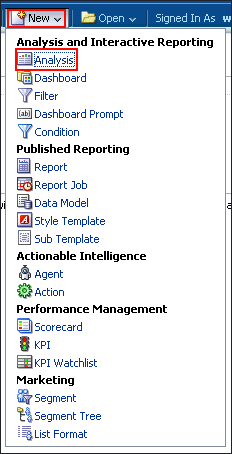 |
||||||||||||||
|---|---|---|---|---|---|---|---|---|---|---|---|---|---|---|---|
| 2 . | The Select Subject Area pop-up appears. A subject area contains columns that represent information about the areas of an organization's business or about groups of users within an organization. When you create a new analysis, this subject area is known as the primary subject area and will appear in the Subject Areas pane of the Analysis Editor. If, as you work, you need more data, you can add additional subject areas if you have permission to access these additional subject areas.  In the Select Subject Area pop-up, select A - Sample Sales. The Analysis Editor is displayed. |
||||||||||||||
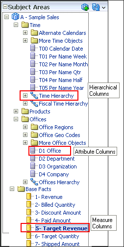
Observe the Analysis Editor, which is used to explore and interact
with information by visually presenting data in tables, graphs, pivot
tables, and so on.  The Analysis Editor is composed of tabs and panes, as shown in the screenshot, representing the subject area (columns), available catalog objects, selected columns for the analysis, and filters (which limit the selected data). A subject area contains folders, measure columns, attribute columns, hierarchical columns, and hierarchy levels that represent information about the areas of an organization's business or about groups of users with an organization. Subject areas usually have names that correspond to the types of information that they contain, such as Period, Regions, Products, Orders, and so on. In this example:
|
|||||||||||||||
|
|
There are various column types in a subject area. They are:
 |
||||||||||||||
| 3 . | a. Select the following columns for your analysis.
 to expand the folders and double-click the required column names to
get them in the Selected Columns section. In this example, expand the
Customers folder>Cust Regions,
and then double-click C50 Region to get it in the Selected
Columns section.
to expand the folders and double-click the required column names to
get them in the Selected Columns section. In this example, expand the
Customers folder>Cust Regions,
and then double-click C50 Region to get it in the Selected
Columns section. 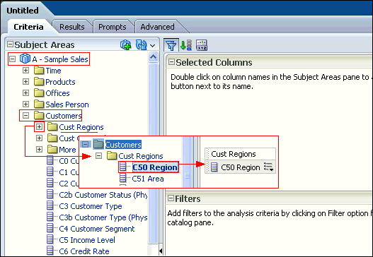 c. The selected columns are displayed in the Selected Columns section. Your analysis criteria should look like this: 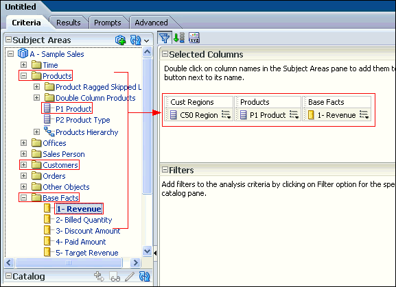 Note: In the Selected Columns section, you can reorder the columns in your analysis by clicking and dragging them. The image shows the step-by-step view of reordering the columns. 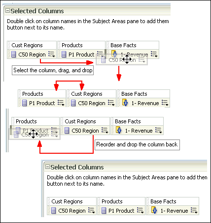 |
||||||||||||||
| 4 . | Click the Results tab. The default Compound Layout is displayed. 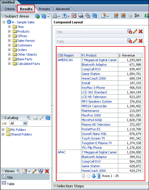 The Compound Layout is a composition of many views. By default, both a Title view and a Table view are defined for you when using attribute and measure columns. A Pivot Table view is automatically created when using hierarchical columns in your analysis. The Title view allows you to add a title (the default), a subtitle, a logo, a link to a custom online help page, and timestamps to the results. The Table view displays results in a standard table. You can navigate and drill down in the data. You can add totals, customize headings, and change the formula or aggregation rule for a column. You can also swap columns, control the appearance of a column and its contents, and specify formatting to apply only if the contents of the column meet certain conditions. Note: In the Compound Layout, you can create different views of the analysis results such as graphs, tickers, and pivot tables. These are covered in the upcoming topics. |
Filtering, Sorting, and Saving Your Analysis
This topic demonstrates how to filter, sort, and save the analysis you have created above.You will add a filter to the analysis and then save the filter. Filters allow you to limit the amount of data displayed in the analysis and are applied before the analysis is aggregated. Filters affect the analysis and thus the resulting values for measures. Filters can be applied directly to attribute columns and measure columns.
A filter created and stored at the analysis level is called an inline filter because the filter is embedded in the analysis and is not
stored as an object in the Presentation Catalog (Catalog). Therefore, an inline filter cannot be reused by other analyses or dashboards.
If you save the filter however, it can be reused and is known as a named filter. (Named filters can also be created from the global header.)
Perform the following steps to filter, sort and save the previously created analysis.
|
1
. |
a. Click the Criteria
tabbed page. Select the column Cust Regions>C50 Region
to create a filter. You can create a filter by hovering over
the specific column's toolbar and selecting the More
drop-down menu.  b. In the More drop-down menu, select Filter. |
|---|---|
|
2
. |
You can also create a filter by clicking the "Create a
filter for the current Subject Area" icon in the Filters
pane and then selecting the column from the drop-down list, as shown
in the screenshot. The column selected for this example is Cust Regions>C50 Region. 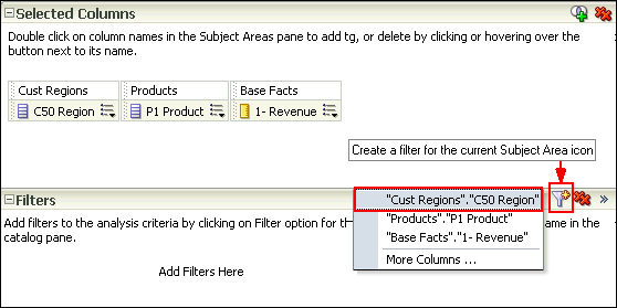 Since you have already selected a filter in the previous step you are not using this option. |
|
3
. |
The New Filter dialog box is displayed. Accept the default value for
the operator (is equal to /
is in), and enter a column value (or a range of column values)
for this condition. To do this, click the drop-down list for Value,
and select the desired checkboxes. Select Americas
and EMEA.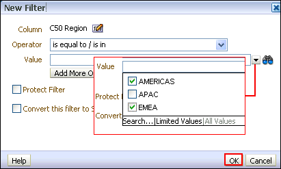 Click OK. |
|
4
. |
The Filters pane displays the newly created filter.  Save this filter. Click the More Options icon in the filters pane and select Save Filters from the drop-down list.  |
|
5
. |
The Save As dialog box appears. A filter must be saved to a subject
area folder so that it is available when you create an analysis using
the same subject area. Navigate to the Subject Area Contents folder under the My Folders. Select the A - Sample Sales folder. Name the filter Americas and EMEA filter and accept the default location. If a Confirm Save Location dialog box appears, accept the default. Oracle BI EE allows you to save any type of business intelligence object to any location within the Catalog. However, for some object types such as filters, Oracle BI EE suggests the best Catalog location. The Save As dialog box should look like this: 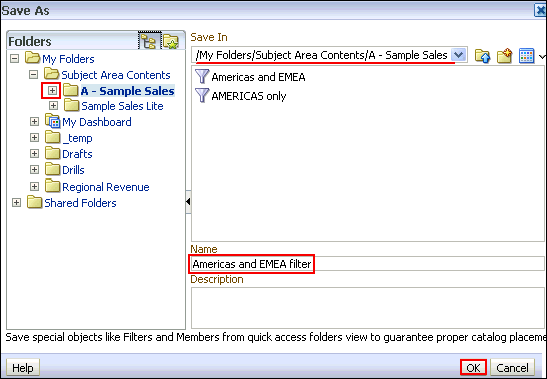 Click OK. |
The Filters pane should look like this: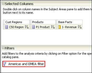 |
|
|
6
. |
Next, you save the analysis so that you can verify the creation of
your named filter within the Catalog. a. Click the Save icon to save your analysis. b. Navigate to My Folders and click the New Folder icon . The New Folder dialog box appears. 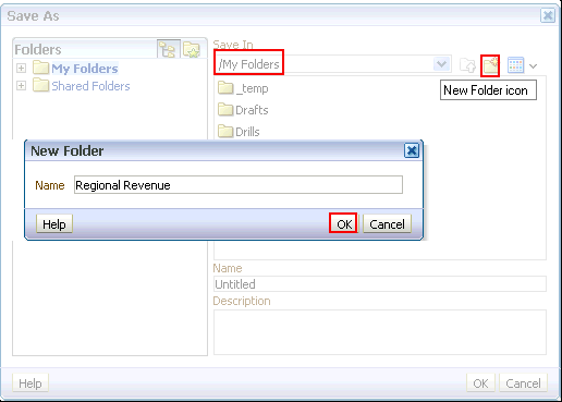 c. Name the folder Regional Revenue and click OK. Save the analysis as Regional Revenue in the catalog folder Regional Revenue. |
|
7
. |
Verify the named filter. Click the Catalog link on the global header and navigate to the folder where you saved your filter. The Americas and EMEA filter is displayed in the Catalog.  |
|
8
. |
Go to Home page, and in the Recent area, click the Edit
link for the Regional Revenue analysis. |
|
9
. |
Now you will add a sort to this analysis. a. On the Criteria tabbed page, click the More Options icon for 1- Revenue. b. Select Sort > Sort Descending. 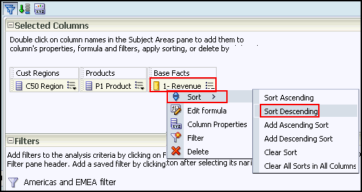 Observe that a sort icon is added to 1- Revenue. The order of the sort is indicated by an arrow; in this case, the arrows points down, indicating that it is descending. Additionally, if multiple sorts are added, a subscript number will also appear, indicating the sequence for the sort order. 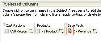 c. Save your analysis again. |
|
10
. |
Click the Results tabbed page to verify the filter
and sort are being applied to your analysis. The Compound Layout displays
the filtered and sorted analysis. 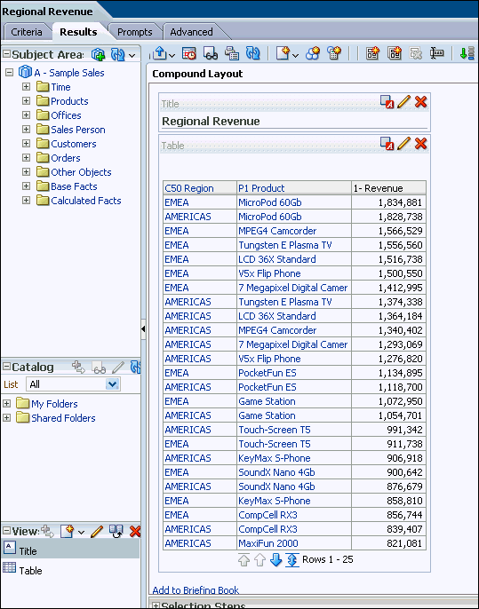 This concludes the topic of saving an analysis and sorting it. |
Creating Selection Steps for Your Analysis
This topic covers how to add selection steps for the product in the analysis. Both filters and selection steps allow you to limit the data displayed in your analysis.Unlike filters that are applied before the analysis is aggregated, selection steps are applied after the analysis is aggregated.
Selection steps only affect the members displayed, not the resulting aggregate values.
For example, the outline total for the top level of a hierarchy is not affected if some members of the hierarchy are excluded from the selection.
Selection steps are per column and cannot cross columns. While measure columns appear in the Selection Steps pane, you cannot create selection steps for them.
Note that however, the grand totals and column totals are affected by selections. You can create selection steps for both attribute columns and hierarchical columns.
To add selection steps for Product, do the following:
| 1 . | Click the plus icon to expand the Selection Steps pane of the Compound Layout. to expand the Selection Steps pane of the Compound Layout. 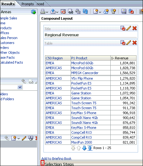 The Selection Steps pane opens.  |
|---|---|
| 2 . |
Under Products - P1 Product, hover over 1.
Start with all members, and click the pencil
icon.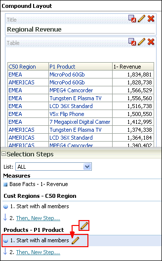 |
| 3 | The Edit Member Step dialog box appears with the list of available products. 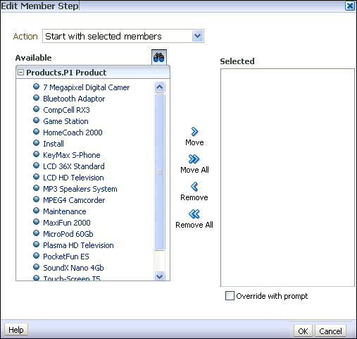 You will use the shuttle icons to move column members between the Available and Selected columns. 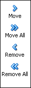 |
| 4 . |
Click the Move All shuttle icon to move all members
from the Available pane to the Selected
pane. 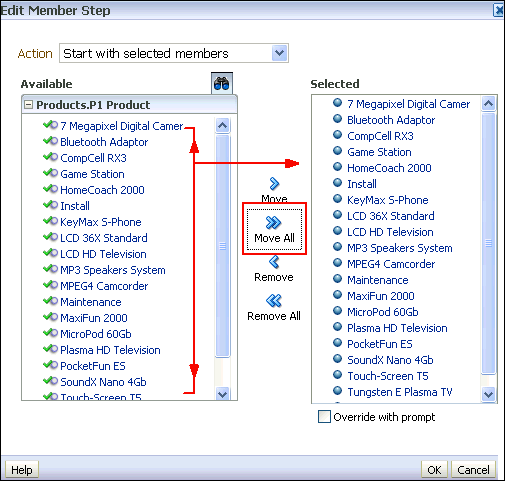 |
| 5 . | In the Selected column, select Install and Maintenance and click the Remove icon to return these two members to the Available column.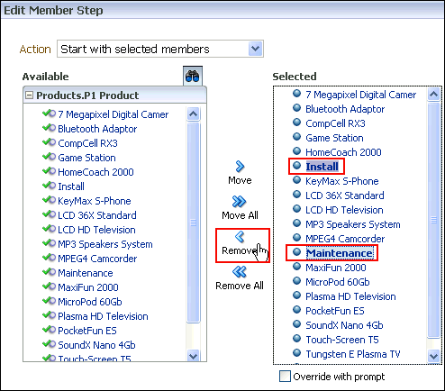 You can use Ctrl+C and click to select multiple members in the list. Click OK. Note that the two members that you removed(Install and Maintenance), are not selected anymore. 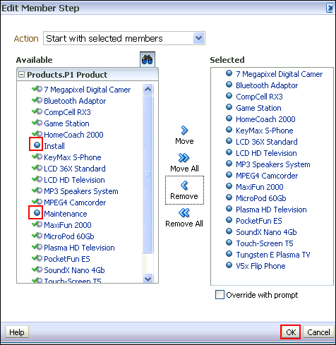 |
| 6 . | a. The Selection Steps pane appears with the
new values added. Observe that you can also save the Selection Steps
as an object in the Catalog by clicking the Save icon.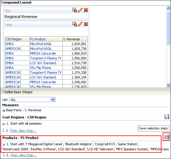 b. Click the minus sign icon to minimize the Selection Steps pane . 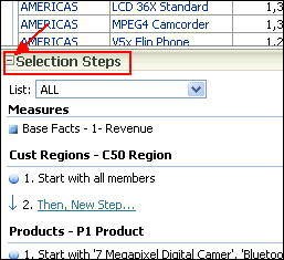 |
| 7 . |
Verify your results by reviewing your analysis in the Table view of
the Results tab. 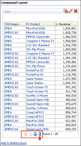 Click the double-headed arrow icon within the Table view to display all rows of the analysis. The analysis appears with all 34 rows. . 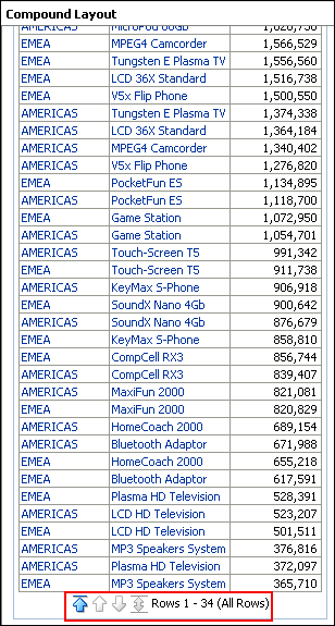 |
Formatting and Adding Totals to Your Analysis
To add formatting and totals to your analysis, do the following:| 1 . | To add totals to your analysis, click the Edit View icon in the Table view.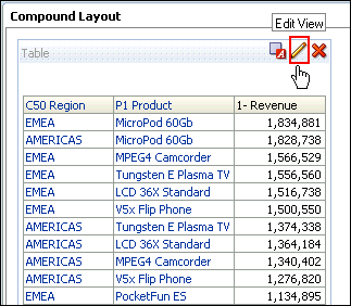 The Table Editor appears. 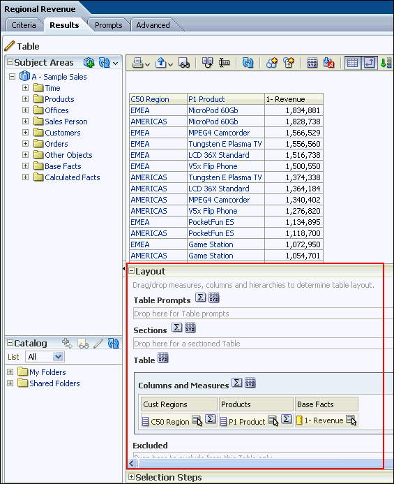 |
|---|---|
| 2 . |
a. To add a grand total to the analysis, click the
Totals icon to the right of Columns and Measures
in the Layout pane of the Table editor. 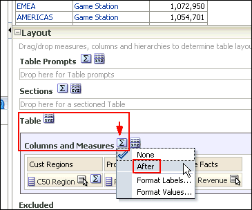 b. Select After from the drop-down list. Review the results in the Preview pane, and note that the Totals icon now displays a green checkmark, indicating that a grand total has been added to the analysis. 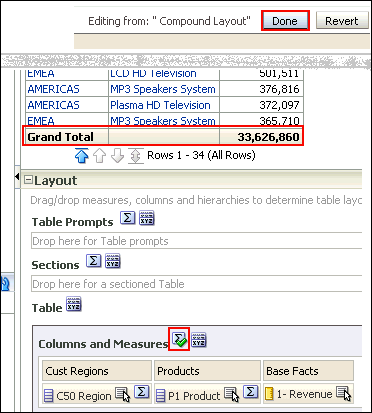 c. Click Done. |
| 3 . | Before adding a total to the Region, remove the sort from 1 - Revenue. a. Click the Criteria tabbed page. b. Click the More Options icon for 1- Revenue and select Sort > Clear Sort. 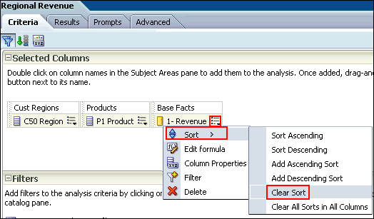 c. Click the Results tabbed page and review the Table view to confirm that the sort has been removed from the analysis.  |
| 4 . | Now you will add a total by region to your analysis. a. Click the Edit View icon  in the Table view. The Table Editor appears. in the Table view. The Table Editor appears. b. In the Layout pane, click the Totals icon for C50 Region.  c. Select After from the drop-down list. Review the results in the Preview pane, and note that the Totals icon now displays a green checkmark, indicating that a total has been added for that specific column/region. 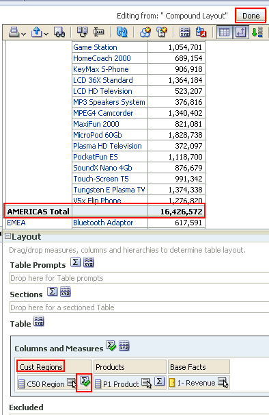 |
| 5 . | After you create and run an analysis, default formatting
rules are applied to the analysis' results. Default formatting
rules are based on cascading style sheets and XML message
files. You can create additional formatting to apply to specific
results. Additional formats help you to highlight blocks of
related information and call attention to specific data
elements. You can also use additional formatting to customize
the general appearance of analyses and dashboards. Now you will apply formatting to the C50 Region column. You apply formatting to a heading. Click the More options icon  for the C50 Region and select Format Headings.
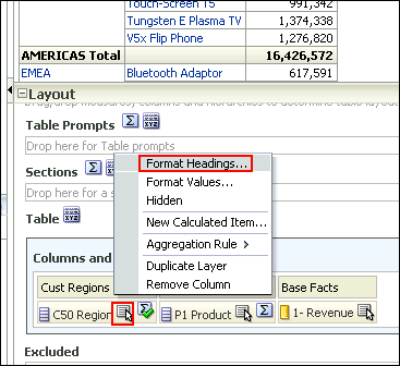 The Edit Format dialog box appears. 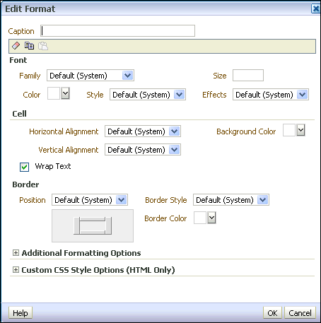 |
| 6 . | a. In the Caption text box, enter Region. b. In the Font area, click the drop-down list for Color and select a red color from the Color Selector dialog box. Click OK. 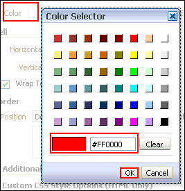 c. In the Cell area, click the drop-down list for Background Color and select a light blue color from the Color Selector dialog box. Click OK. 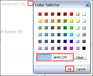 d. Click OK in the Edit Format dialog box to see the results of your format changes for the C50 Region. The Preview pane should look like this: 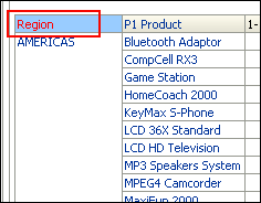 |
| 7 . | a. Click the Table View properties icon on the toolbar.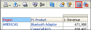 The Table Properties dialog box appears. 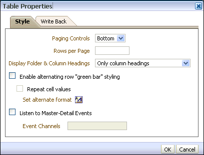 b. Select the Enable alternating row "green bar" styling check box, and click OK. 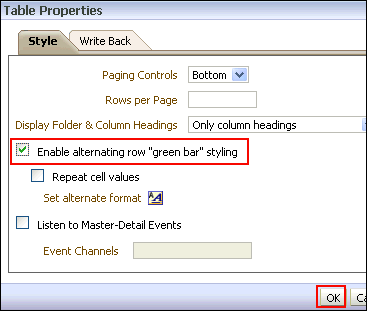 c. The Preview pane should look like this. Click Done and then save your analysis. 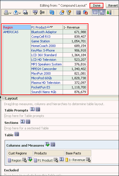 This concludes the topic of formatting and adding totals to your analysis. |
No comments:
Post a Comment