In this topic, you learn how to add a graph to an analysis, and how to apply a saved filter and format the graph.
Enhancing an Analysis by Adding a Graph
In this subtopic, you begin by creating a new analysis to which you add a graph and apply a named filter created in the first topic. Perform the following steps:| 1 . |
Create a new analysis by using the same columns that you used to create
Regional Revenue. Select New
> Analysis on the global header. Use A
- Sample Sales Subject Area.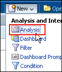 |
|---|---|
| 2 . | Add C50 Region from Cust Regions, P1 Product from Products, and 1 - Revenue from Base Facts to Selected Columns.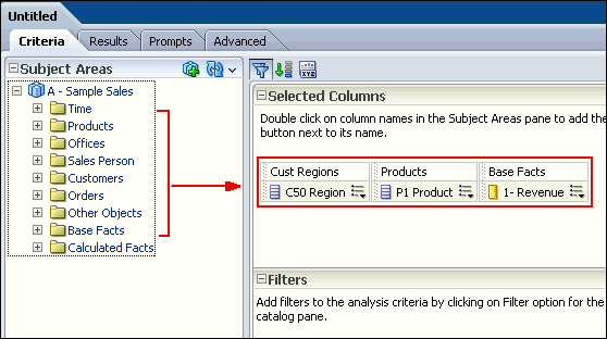 |
| 3 . |
Next, you will add a named filter that you previously created to limit
the analysis to just Americas and EMEA data. a. In the Catalog pane, navigate to locate your filter Americas and EMEA filter. 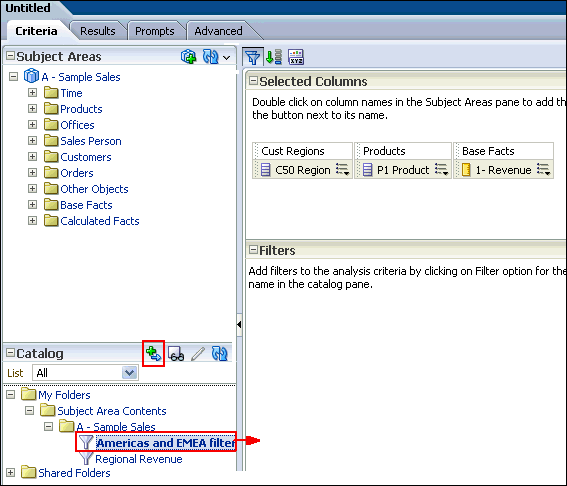 b. Select the filter and click the Add More Options icon. |
| 4 . |
a. In the Apply Saved Filter dialog box, select the
Apply contents of filter instead of a reference to the filter
check box. This option adds the filter as an inline filter, allowing
you to make changes without changing the Catalog filter item. Note that
if you do not select this check box, the filter is added as a named
filter that you can view, but not edit.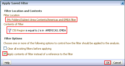 b. Click OK. The filter is added to your analysis. 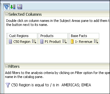 |
| 5 . | Save the analysis to your Regional Revenue folder, entering Regional Revenue Graph as the analysis name.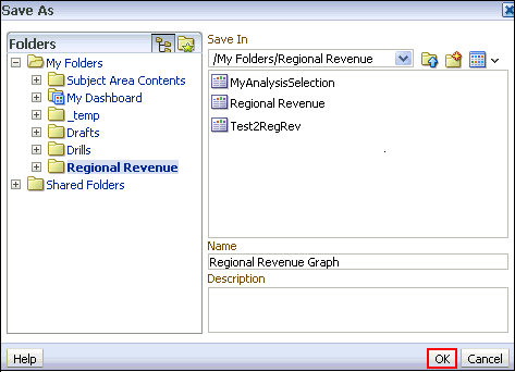 |
| 6 . | You will add a graph to this analysis. a. Click the Results tabbed page, and click the New View icon. 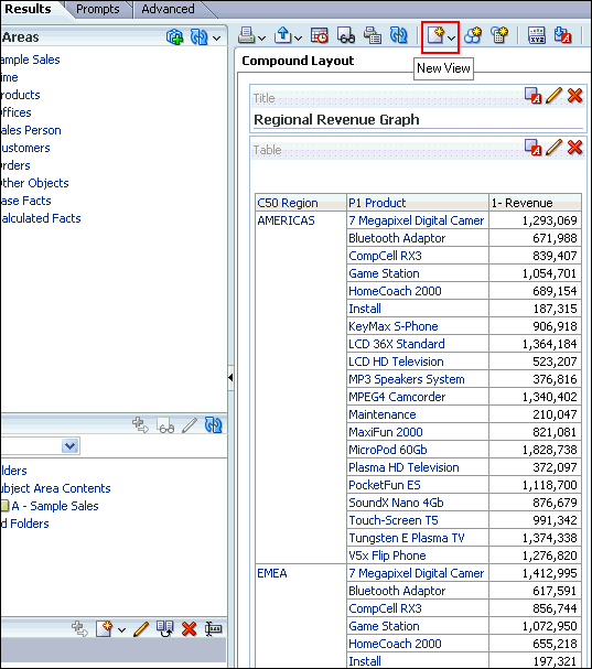 b. Select Graph > Bar > Default (Vertical) from the menus. 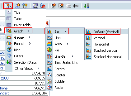 The default Graph view appears below the Table view. 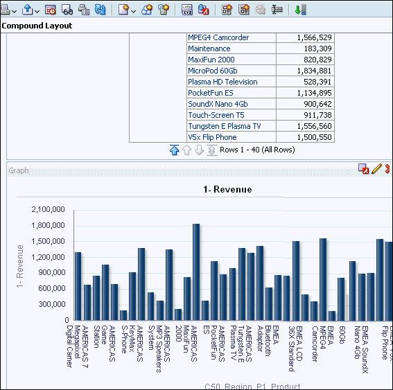 |
| 7 . | Click the Remove View from Compound Layout icon for both Title and
Table views. 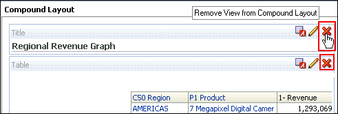 Both views are removed from the Compound Layout. Note however, that they are still available for use from the Views pane.  |
| 8 . | Save the analysis. |
Formatting the Graph
To enhance the appearance of a graph, perform the following steps:|
1
. |
Click the Edit View
icon to begin your formatting changes. The Graph editor appears.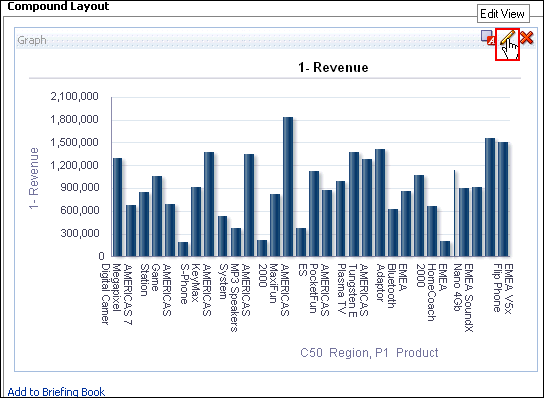 |
||||||||
|---|---|---|---|---|---|---|---|---|---|
|
2
. |
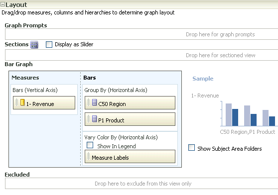
The Graph, like other view editors, is composed of three sections:
|
||||||||
|
3
. |
Click the Edit properties
icon. 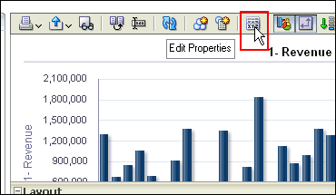 The Graph properties dialog box appears.  The Graph properties dialog box is composed of four tabbed pages: General, Style, Scale, and Titles and Labels. These tabbed pages allow you to do the following:
|
||||||||
|
4
. |
a. Select Enable
for Horizontal Axis from the "Zoom and Scroll" check
boxes. When zooming and scrolling is enabled for a graph, then the graph
includes a Zoom icon. The Zoom icon allows you to zoom in and out of
a graph's plot area via its axes. Once you zoom in on an axis, you can
scroll the axis. When you zoom an axis, a zoom and scroll slider appears. b. Select left from the Legend location drop-down list. The dialog box should look like this: 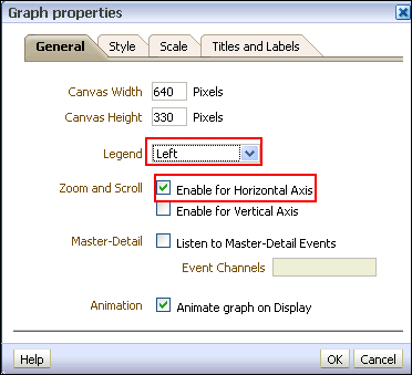 Note: The "Animate graph on Display" checkbox specifies whether to show initial rendering effects and is selected by default. For example, the bars on a horizontal graph start at the x-axis and move up the scale on the x-axis to the current measurement level. "Listen to Master-Detail Events" allows you to specify this analysis as a detail view in a master-detail relationship. You will use this option in a subsequent step when working with pivot tables |
||||||||
|
5
. |
a. Click the Style
tabbed page. 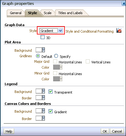 b. Click the Style drop-down list for Graph Data and select Gradient. The Graph Data area allows you to choose a style for specific types of graphs. For example, you might choose pattern fill for to highlight differences on a line-bar graph or gradient for a bar graph to make the data values standout. |
||||||||
|
6
. |
Click the Background
drop-down list in the Plot area, and select a
light blue color from the Color Selector. Click OK.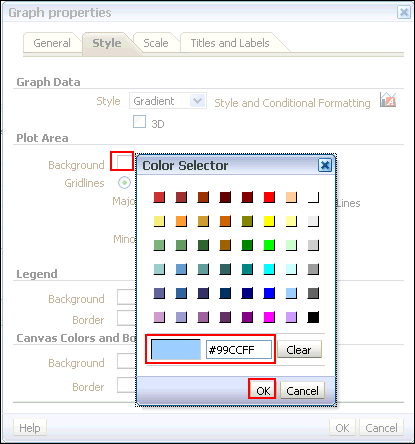 The Graph properties dialog box should look like this: 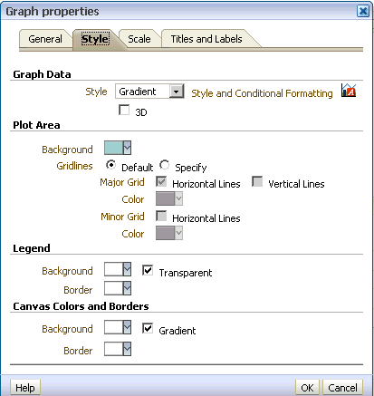 |
||||||||
|
7
. |
Click the Scale tabbed
page. The Scale tabbed page appears.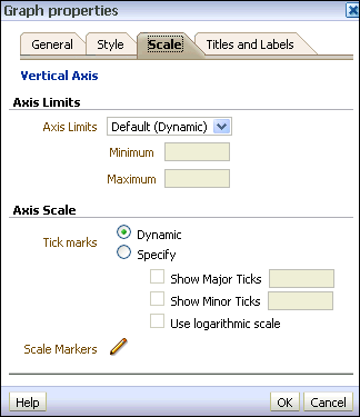 Specifying setting for the axis limits and tick marks enables you to control what you see on your graph. If you override the system default for tick marks, the colors that you have selected for horizontal and vertical gridlines on the General properties tabbed page will be applied to both major and minor ticks. |
||||||||
|
8
. |
a. Click the Titles
and Labels tabbed page. 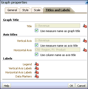 b. Deselect the check box for Use measure name as graph title and enter Regional Revenue in the Title text box. 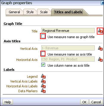 c. Click the Format Title icon  for Graph Title.
 The "Font Format: Title" dialog box appears. You use this dialog box to specify how titles, legend labels, and so on are handled (such as truncated automatically) and to specify font properties. Click Cancel. 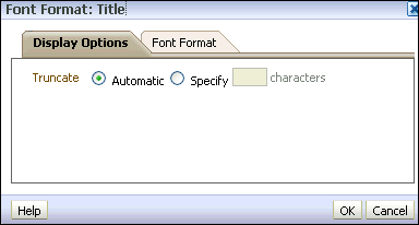 |
||||||||
|
9
. |
Deselect the check box for Vertical
Axis Title and click OK
to close the Graph Properties dialog box.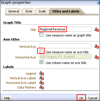 The preview pane refreshes and should look like this: 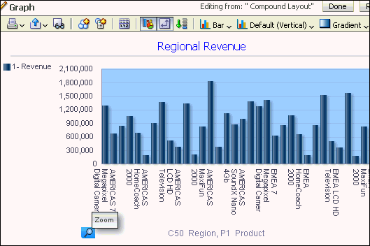 Examine the changes that you made to the graph. The formatting changes have been applied along with a new title and a horizontal zoom. |
||||||||
|
10
. |
Click the Zoom icon
and select Zoom In.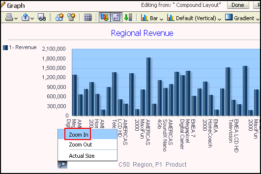 Once you have zoomed in, a slider appears. 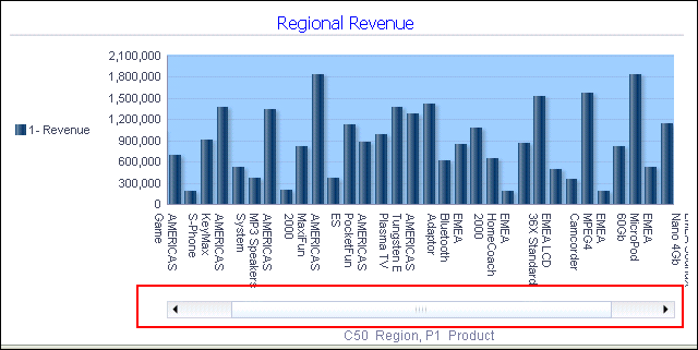 |
||||||||
|
11
. |
a. In the Layout pane, move C50
Region from the Group By drop target to the Graph Prompts drop
target. The preview pane refreshes:  The prompt allows you to select each region individually, making the graph a bit easier to consume. b. Move C50 Region to the Sections area and select the Display as Slider check box. The Graph editor should look like this: 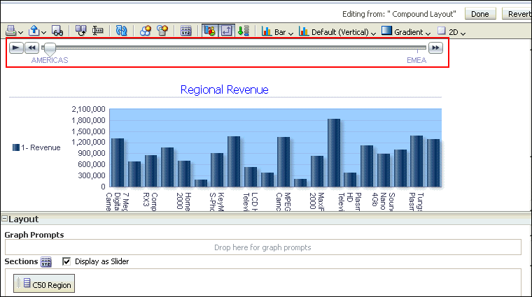 When you move along the slider for a particular region, the graph changes accordingly. c. Click Done and then save your analysis. 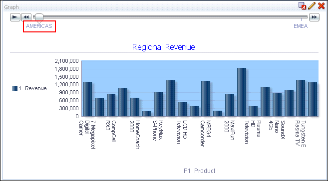 You can further experiment with the region slider by clicking the C50 Region or Americas link. The graph display changes accordingly. 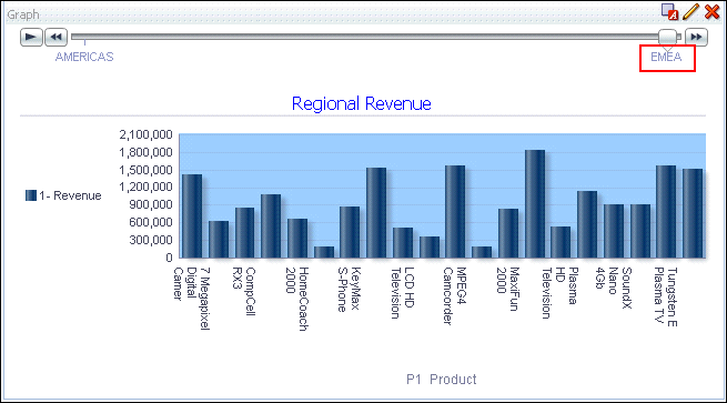 |


No comments:
Post a Comment