In this post, we learn to create a report using the Data Model which we have created in the Previous Post.
So we can this post a continuation of previous post. We are going to
learn How to create a report step by step. So Login into BI Publisher
and follow the steps and Do not log out from the window to ask to do so.
Step1:
Once we logged into the BI Publisher click Report from create tab of left side pane or click New -> Report. Refer below screenshot
Step2:
Step13:
select Department Name column and click 'Grouping' option and select above. So the department column will come like prompt above the table report.
Select 'Hire Date' column and click Data formatting option. There we will get various option to select. Select any particular type of date which you want to display in the data format.
Step14:
Now select Salary column and click Data formatting, there we will get various option like thousand separator, currency symbol, decimal point and etc., So apply the formats which you want to do with the salary columns.
Step15:
From conditional formatting we can apply the conditions same like when we are creating an analysis with presentation columns in a subject area. So here I have applied the conditional formatting in salary which will give red back ground when salary is less than or equal to $4999, and will show yellow background when salary between $5000 to $9999 and will show green background when salary is greater that or equal to $10000
Step17:
Insert layout grid with single row with three column below the table report and insert a data label into each column.Now apply page elements into the footer like page number, time, date. Finally save the report and select 'PDF' format from the various format which is available in the list.
Showing the reports into Interactive Dashboard:
Step1:
Once we logged into the BI Publisher click Report from create tab of left side pane or click New -> Report. Refer below screenshot
Step2:
Select 'Use Existing Data Model' to use the data model to create the report
Step3:
Select the 'Sample_Employee_DM' data model which we have created in the previous session. and click 'Next'
Step4:
Once we selected the data model we will get two options to use
i. Guide Me -> Which is having further few more steps to create the report
ii. Using Report Editor -> Which will take the select data model and will give the
Select 'Guide Me' and click Next
Select 'Guide Me' and click Next
Step6:
In this step save the
report with the name 'Employee Report' in the 'Reports' folder inside
the 'Publisher' folder. and click Save
Step7:
In the next step select 'View Report' and click 'Finish'
Step8:
Once we clicked 'Finish'
with the above step It will open the report in the default layout with
table data format. We can ascend, descend or filter the reports by
clicking on the column header. We can see the Department Name as a
prompt in the report.
Step9:
Click properties and
click 'Edit Layout' with the above step. We will get the report in the
layout editor with the default table data format.
Step9:
Just select all columns
and data of this default data table format and delete it. Now empty
space will be available. Click on 'Layout Grid' and insert 2X2 rows and
columns
We will get the below screen
Step10:
Now click on the first
grid in the layout and insert the Bar chart into that grid and drag the
department name column from data model to bar chart series label and
drag the salary column into the value labels in the bar chart.
Now apply the summation average to see the average salary of total employees by department wise.
Step11:
Now select the second
grid in the first row of the layout and insert a pie chart with ring
type and drag the department name and salary in series label and value
label respectively.
Now the layout is ready
with two chart report. In the pie chart apply percentage from summation.
so the pie chart will represent the percentage of salary by department
wise.
Step12:
Now select second row
from the layout. select two columns from second row and merge that into a
single row. Now select 'Data Table' from insert table and drag into the
second row of the layout.
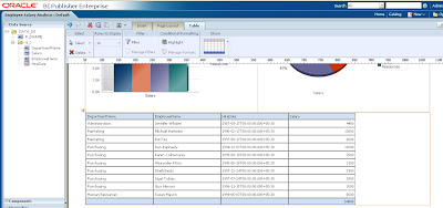
Now drag Department name, employee name, hire data, salary from data model into that data table.
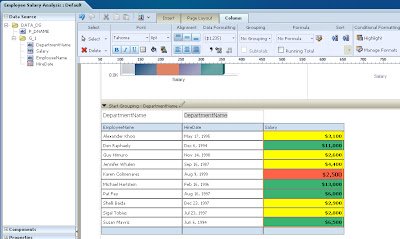
select Department Name column and click 'Grouping' option and select above. So the department column will come like prompt above the table report.
Select 'Hire Date' column and click Data formatting option. There we will get various option to select. Select any particular type of date which you want to display in the data format.
Step14:
Now select Salary column and click Data formatting, there we will get various option like thousand separator, currency symbol, decimal point and etc., So apply the formats which you want to do with the salary columns.
From conditional formatting we can apply the conditions same like when we are creating an analysis with presentation columns in a subject area. So here I have applied the conditional formatting in salary which will give red back ground when salary is less than or equal to $4999, and will show yellow background when salary between $5000 to $9999 and will show green background when salary is greater that or equal to $10000
Step16:
Apply save after every
bit of work has done. grid layout into above and below the reports to
apply a header and footer. So after inserted a single row with two
columns above the chart insert two data labels into the columns and
Double click into the label to give the name of the charts.
Step17:
Insert layout grid with single row with three column below the table report and insert a data label into each column.Now apply page elements into the footer like page number, time, date. Finally save the report and select 'PDF' format from the various format which is available in the list.
Now we will get the
report like below screen which is showing 'Employee Salary Analysis'
report with two charts and one data table.
We can add the BI
Publisher reports into the dashboard. For this we need to edit the
dashboard page and select the publisher report from saved folder and
drag into the dashboard page where we want to display the report. Save
and run the dashboard. We can see the publisher report into the
dashboard.


No comments:
Post a Comment